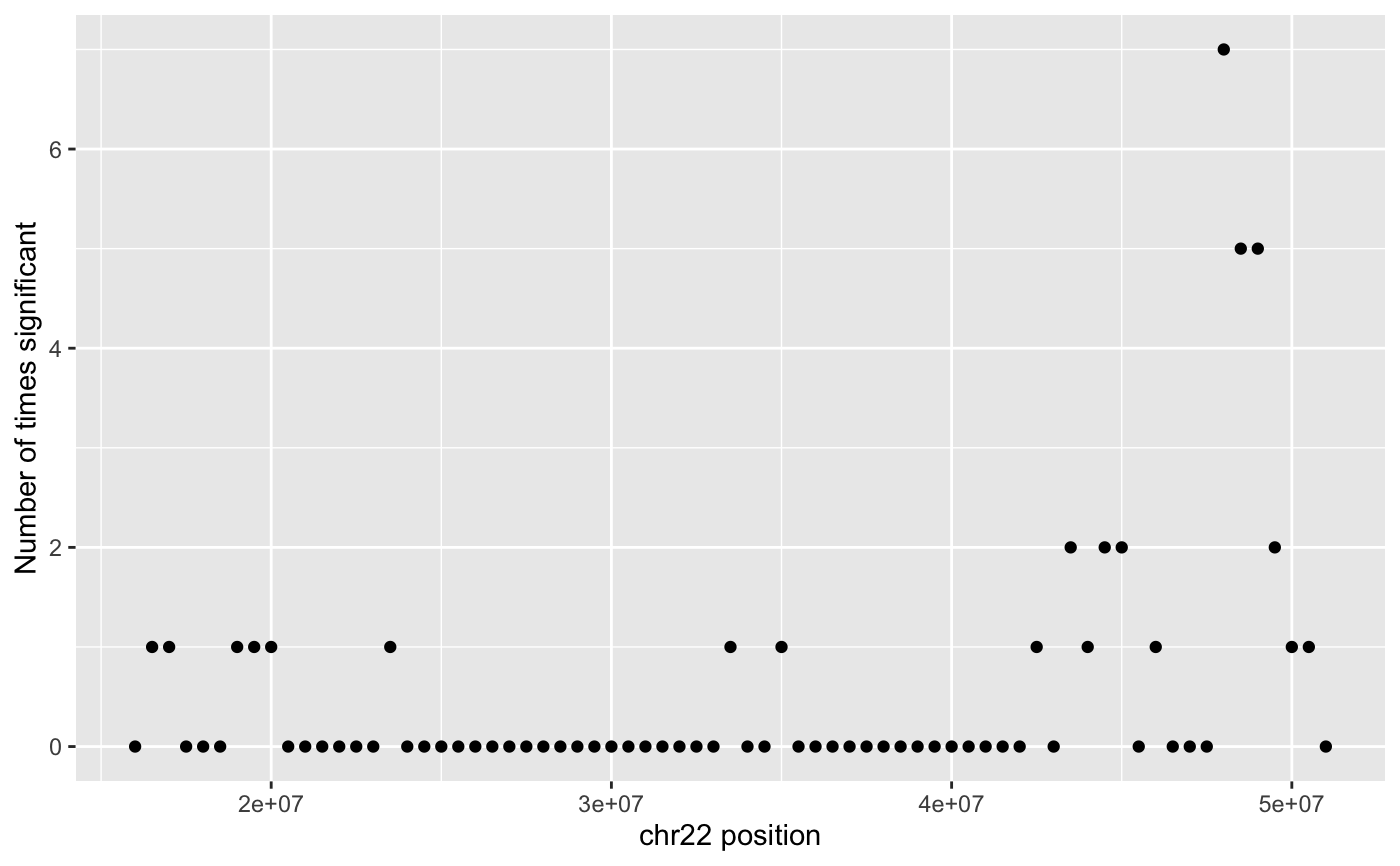
Create a Manhattan plot for the results of HiCcompare
manhattan_plot(hic.table, adj.p = TRUE, alpha = 0.05, return_df = FALSE)
Arguments
| hic.table | a hic.table object that has been normalized and had differences detected. |
|---|---|
| adj.p | Logical, should the adjusted p-value be used (TRUE) of the raw p-value (FALSE)? |
| alpha | The alpha level for calling a p-value significant. |
| return_df | Logical, should the data.frame built to be used for plotting be returned? If TRUE then the data.frame will be returned and the plot will only be printed. |
Value
A manhattan plot.
Details
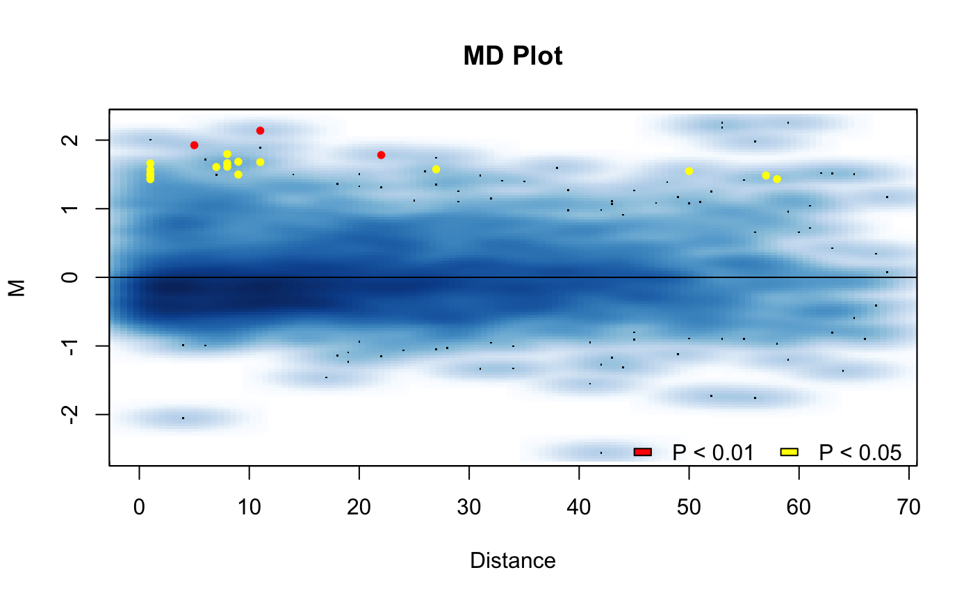
This function will produce a manhattan plot of the results of hic_compare(). Can be used to display which regions around found to be significantly different on the linear genome.
Examples
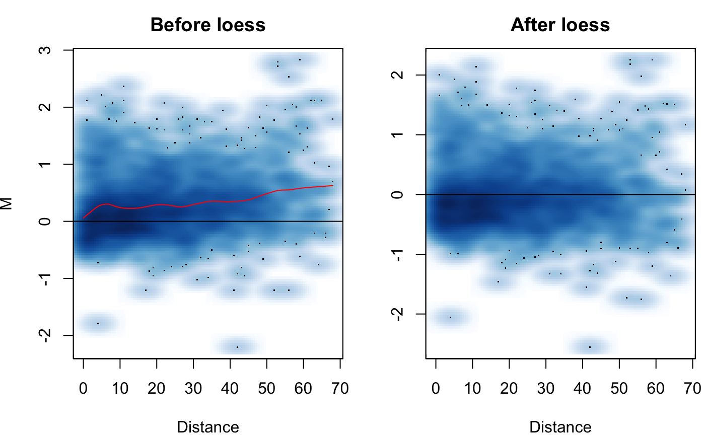
# Create hic.table object using included Hi-C data in # sparse upper triangular matrix format data('HMEC.chr22') data('NHEK.chr22') hic.table <- create.hic.table(HMEC.chr22, NHEK.chr22, chr = 'chr22') # Plug hic.table into hic_loess() result <- hic_loess(hic.table, Plot = TRUE)#>#>#>#>